|
Joăo Meneses passed some recommendations about buoys to me. They seem
worthy of mentioning to anyone with responsibility for running an event.
The recommendations come from Nick Weall.
As a result of informal meetings held in 1993 at International Regattas the
Racing Rules Committee has reviewed the issue of Buoys, relating to their
Size, Markings & Moorings. We propose that we issue guidelines to Race
Committees regarding the type of buoy to be used:
- We suggest the use of spherical buoys for start and finish lines of a
diameter between 200 and 500mm.
- We suggest that all marks be numbered with numbers at the maximum size
for sail numbers of the class being raced. These numbers to be of a colour
to plainly contrast with the background colour of the buoy and placed in
regular intervals around the buoy, so that at least one number can be read
from the control area, no matter how the buoy turns.
- We suggest that all marks of the course be so laid that the numbers on
the buoys are plainly distinguishable from the control area.
- We suggest that all other buoys are at least cylindrical and preferably
spherical in shape. They should also be of a scale suitable for the class
of yacht racing, i.e. The height of the buoy should not exceed fifty
percent of the height of the mast of the class being sailed.
- We suggest that all marks of the course shall be anchored by means of a
line passing through a pulley on the underside of the buoy, with one end
of the line attached to a heavy weight and the other end secured to a
lighter weight that can hold the buoy well down in the water, whilst
permitting variations in the water level. The lighter weight must also be
sufficiently heavy to maintain the mooring line as near to the vertical as
possible.
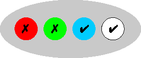
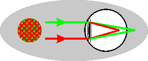
There is something more to think about, and that is the colour of the
buoys. Reds, particularly day-glo oranges, are popular choices, but in my
opinion are unwise choices. The reason is that the human eye focuses reds
earlier on the retina, and as a result such objects appear to be closer than
they really are. It is an effect that seasoned racers are aware of, and
they give an extra few boat lengths rounding distant red marks. White is
ideal, as are blues. Green marks suffer the inverse effect, and seem
further away than they really are. This is why so-called "3-D"
comics are printed with red and green inks, and why you wear "3-D"
glasses with one red filter and one green filter to see the "3-D"
effect.
2005-12-18 |